
This article assumes you to have some basic understanding of Web Components and how they work. If you are new to Web Components, you might look at some intro articles and webinars of my colleagues Manuel Rauber and Patrick Jahr first.
Version information: The data and code in this article are based on Angular 13+
Introduction
As passionate Angular developers, we are tempted to solve every upcoming problem with our favorite framework. But not every company out there has homogeneous frontend developer teams. Many of them have mixed teams that use different frameworks. Accordingly, you want to develop a single component library built upon your corporate design guidelines that can be used and integrated with every framework your developers use or may use in the future.
Due to their framework independence and lightweight nature, Web Components are the perfect solution to this problem. But just the previously mentioned integration of Web Components into the individual frameworks can prove to be very difficult when designing the components.
We’re now getting our hands dirty and will develop a Web Component ourselves. We will look at two possible approaches and then try to integrate the component into Angular as an example.
So let’s find out which approach will perform better and first look at the component we will build.
Our component
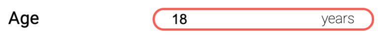
The component will be a form input field. It has a left-aligned label, the input field content, and, as an addition, the possibility to add any suffix to it, which will add a little spice to our development in the last run.
To build Web Components, we have a lot of different possibilities. We may create them with plain JavaScript or use some framework. Each way, in turn, has its pros and cons, but that could be the topic of another article.
For today, we will use the Lit library (formerly known as Lit-Element) because, on the one hand, it hides away most of the boilerplate code to register and add custom elements to the DOM. And on the other hand, we get additional tooling for a much cleaner developer experience.
Now that we know the goal let’s start with our first approach!
Approach 1: Hide everything inside the component
We create a new component, place the label and input elements inside, add some styling and expose the corresponding properties to the outside world. To make it possible to add any suffix to the input content, we use the slot Element, which acts similar to ng-content and reserves space for any content projected in our component.
					/** tt-input.ts **/

import { ... }

@customElement('tt-input')
export class TtInput extends LitElement {
  @property({ type: String }) label = 'Label text:';

  @property({ type: String }) id = 'input';

  @property() value: string = '';

  static styles = css`
    ...
  `;

  render() {
    return html`
      <label for=${this.id}>${this.label}</label>
      <div class="input-box">
	    <input id=${this.id} type="text" />
		<slot></slot>
      </div>
   `;
  }
}
So far, nothing special to see here. At first glance, the value property may not make sense, but bear with me; we’ll need it soon. Let’s jump right into our example Angular application and use our freshly built web component in a reactive form.
First integration
At first, we go into the app.module.ts and import our web component package by adding an import statement at the top. The import reference is just the name property we defined in the package.json of our web component workspace. In this case, @tt/input.
					/** app.module.ts **/

import { ... }
import '@tt/input';
import {CUSTOM_ELEMENTS_SCHEMA, NgModule} from '@angular/core';

@NgModule({
  declarations: [
    AppComponent,
  ],
  imports: [
    BrowserModule,
    AppRoutingModule,
    ReactiveFormsModule
  ],
  providers: [],
  bootstrap: [AppComponent],
  schemas: [CUSTOM_ELEMENTS_SCHEMA]
})
export class AppModule { }
Last but not least, we have to tell angular to accept custom elements. By default, Angular only takes custom elements declared within the Angular application in the form of Angular components. To tell Angular to accept external components, we need to add the schemas property to the module and fill it with the CUSTOM_ELEMENTS_SCHEMA. For simplicity reasons, we apply it application-wide at the level of the app.module. Keep in mind that this approach is not recommended for real-world projects!
Instead, import and use external custom elements in a separate module and apply the CUSTOM_ELEMENTS_SCHEMA just for that single module.
Now we set up a reactive angular form, include our web component, start our application and see … nothing.
					/** app.component.ts **/

<form [formGroup]="form">
	<tt-input label="Name" formControlName="name"></tt-input>
    <tt-input label="Last Name" formControlName="lastName"></tt-input>
    <tt-input label="Age" formControlName="age"><span>years</span></tt-input>
</form>

<span>
  {{form.value | json}}
</span>
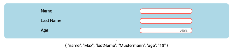
Although the underlying reactive form contains the correct default values. Nothing gets displayed in our component. And that isn’t surprising at all. Although we have tagged the element with formControlName, Angular doesn’t know how to interact with it. This is just the same problem we have when using other angular components like regular form components. In these cases, we need to implement the ControlValueAccessor to make the component known to Angular.
Adding a ControlValueAccessor
Because we are a Web Component, we can’t directly implement the interface on a component level. In this case, we help ourselves with a directive whose selector exactly matches the HTML tag of our Web Component. This will instantiate the directive whenever our component is used, connecting the Web Component and form control.
					/** tt-input.directive.ts **/

const TT_HIDDEN_INPUT_VALUE_ACCESSOR: Provider = {
  provide: NG_VALUE_ACCESSOR,
  useExisting: forwardRef(() => TtInputDirective),
  multi: true,
};

@Directive({
  selector: 'tt-input',
  providers: [TT_HIDDEN_INPUT_VALUE_ACCESSOR]
})
export class TtInputDirective implements ControlValueAccessor
{
  val = "";
  onChange: any = () => {};
  onTouch: any = () => {};

  set value(value: string){
    if(!value) return;
    this.val = value;
    this.elRef.nativeElement.value = this.value;

    this.onChange(value);
    this.onTouch(value);
  }

  constructor(private elRef : ElementRef) {}

  registerOnChange(fn: any): void { ... }

  registerOnTouched(fn: any): void { ... }

  writeValue(value: string): void {
    this.val = value;
    this.elRef.nativeElement.value = value;
  }
}
Let’s rerun our demo application and see what has changed. Now we can see that Angular detects the input as a form control and sets the initial value. But our web component doesn’t display the value, and neither the form value changes when we type something in our input field.
We need additional tweaking of our web component and the just created directive to make this work.
Now the time has come that we need the value property mentioned initially, which will make the input value accessible to the outside world. Then we need to set the inner input value to our value after the first render and emit a custom event every time our input value changes. In the Angular directive, we need to listen to the event.
					/** tt-input.ts **/

@customElement('tt-input')
export class TtInput extends LitElement {
  @property({ type: String }) label = 'Input within Shadow DOM:';

  @property() value: string = '';

  @query('input') input!: HTMLInputElement;

  /* ... */

  render() {
    return html`
      <label for=${this.id}>${this.label}</label>
      <div class="input-box">
        <input type="text" @input="${this.handleInput}" />
        <slot></slot>
      </div>
    `;
  }

  protected firstUpdated(changedProperties: PropertyValues) {
    super.firstUpdated(changedProperties);
    this.input.value = this.value;
  }

  private handleInput() {
    this.value = this.input.value;
    this.dispatchValueChange();
  }

  private dispatchValueChange() {
    const options = {
      detail: this.value,
      bubbles: true,
      composed: true,
    };
    this.dispatchEvent(new CustomEvent('change', options));
  }
}
					/*tt-input.directive.ts*/
@HostListener("valueChange", ['$event.detail'])
onHostChange(value: string){
  this.value = value;
}
With this code in place, we can see that everything works as smoothly as expected, and we can use our web component in Angular forms. But we must admit that this approach is tedious and needs a lot of effort and Angular code to make Web Components and Angular work together. Imagine you have to do this for EVERY Web Component you want to use in any form. Yikes!
A first resume
Before moving on, take a step back and look at what we have done. We wrapped our native HTML elements in a Web Component and sent them to the Shadow DOM. Therefore they are unreachable for Angular (or any other framework). Then we had to add a value property to the component to pipe the underlying input value through to the Light DOM. Also, keep in mind that you have to pipe through any other properties you want to apply to the inner input, e.g., disable, readonly, etc. This will rapidly grow the Web Components API.
It doesn’t feel right, does it? In addition, we violated some core principles we should have kept in mind on our way. We broke the Single Responsibility Principle by adding duplicate input states and event handling. Furthermore, by hiding the native elements inside our component, we violated the Inversion of Control principle because we restricted the external control of what can be displayed inside to a very minimum.
So is there a better approach? Yes, there is!
Approach 2: Using the power of slotting / content projection
With our second approach, we leave the native form elements in the Light DOM and project them into the Web Component. By letting them live in the Light DOM, we have complete control over what can be displayed inside the component and solve our Inversion of Control problem. We also can get rid of all the ControlValueAccessor shenanigans because we now can directly access and integrate the native elements in reactive forms, as we are used to.
					/** app.component.ts **/

<tt-input>
  <label for="age">Age</label>
  <input type="number" id="age" formControlName="age"/>
  <span>years</span>
</tt-input>
The tt-input.directive.ts also served its purpose so that we can get rid of it. When we look at our Web Component’s code now, we can see that we can remove all the unnecessary properties and event handling functions as well.
Hidden rearrangements behind the scenes
Because we want the suffix inside our input field, we need to style the suffix slot and input together. To make this possible, we need some surrounding containers. But we can’t assume that the developer who uses our component knows about this fact and has already added such a boxing element inside the projected template. So we have to take action and rearrange the projected elements the way we want them to be. In this case, we need to extract the label because we want it to be outside the boxed element.
With @queryAssignedElements we can grab the projected label and assign it to the right slot whenever the slotted content changes by listening to the slotchange event. In the case of styling, we can apply the same styles for the label or input elements before, just by scoping them to the slotted contend with the ::slotted() pseudo-selector.
					/** tt-input.ts **/

@customElement('tt-input')
export class TtInput extends LitElement {

  @queryAssignedElements({ selector: 'label' })
  slottedLabel!: ReadonlyArray<HTMLLabelElement | undefined>;

  static styles = css`

    ::slotted(label) {
      text-align: right;
    }

     ::slotted(span) {
      font-size: 0.8rem;
      order: 3;
    }

    ::slotted(input:focus-visible) {
      border: none;
      background-color: transparent;
      outline: none;
    }
     /* ... */
  `;

  render() {
    return html`
      <slot name="label"></slot>
      <div class="input-box">
        <slot @slotchange=${this.handleSlotChange}></slot>
      </div>
    `;
  }

  private handleSlotChange(): void {
    const [label] = this.slottedLabel;
    if (label) {
      label.setAttribute('slot', 'label');
    }
  }
}
Summary
The first approach hides the native elements in the Shadow DOM, forcing us to pipe through all the properties we wanted to set from the Light DOM, duplicate the inputs value property, write interoperability code in Angular, and violate our underlying principles of component design. Also, note that we covered just a tiny fraction because we did not look into the additional problems with this approach regarding keyboard navigation or accessibility. Under given circumstances, this could be a valid choice. But for the following reasons, we should favor the second approach as much as we can.
The second approach needs much less code, plays well with the principles of component design, and lets us take advantage of the built-in features of native elements. Allowing the native input elements to live in the Light DOM also directly removed the just mentioned accessibility problems because native elements have built-in keyboard-navigation support. Possible accessibility roles can also be added to the elements.
In conclusion: When it comes to the fact that we want to use our Web Components like native form elements, it is best to use the native elements because we don’t want to reimplement what the browser already gives us. And this also applies when it comes to framework integration because every framework out there knows how to handle and interact with native elements.