Introducing LitElement: simply put, it is a base class which helps us to create fast and lightweight Web Components. Additionally, it is more convenient for writing our code. In this article, I will show you how to create and publish Web Components with LitElement in a practical way.
What to expect
- Learn how to create a native Web Component using LitElement
- Step-by-step explanations
- How to render your HTML template
- Adding styles
- Using asynchronous properties
- All based on a sample built with Visual Studio Code
You can find a running example on stackblitz.
What is LitElement?
LitElement is a pure base class for creating fast, lightweight Web Components that work in any web page with or without a framework of your choice. LitElement uses lit-html to render into the Shadow DOM and adds the API to manage properties and attributes. Properties are kept up to date asynchronously as soon as values change. And the best of all: LitElement works in all major browsers like Chrome, Firefox, Edge, or Safari.
Preparations to create your Web Component with LitElement
First of all, we have to install two packages. The first package is polymer-cli, which we need to build, serve, and deploy our LitElement Web Component. The second package is lit-element, which installs all modules to use LitElement for your Web Component. To use LitElement to develop our Web Component, we basically have to inherit from the LitElement class. The LitElement class implements all Custom Element lifecycle methods like connectedCallback or attributeChangedCallback.
					import { LitElement } from 'lit-element';

export class CustomDropDown extends LitElement {}
Render the lit-html template
To write a template, import html from the lit-element package. In the Lifecycle of LitElement, there is the render method wich we have to implement to write our HTML Template. This method will be called by the LitElement base class and returns the HTML template for our LitElement.
import { LitElement, html } from 'lit-element';
export class CustomDropDown extends LitElement {
render() {
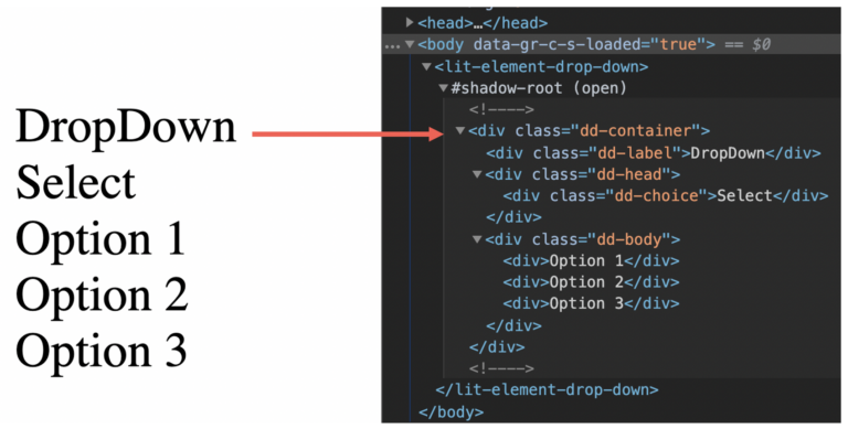
return html`<div class="dd-container">
<div class="dd-label">DropDown</div>
<div class="dd-head">
<div class="dd-choice">Select</div>
</div>
<div class="dd-body">
<div>Option 1</div>
<div>Option 2</div>
<div>Option 3</div>
</div>
</div>`;
}
}
In the sample above, we create a HTML template for the sample dropdown Web Component. The render method returns a TemplateResult that lit-html can render. After that, we define our Web Component via the Custom Elements API.
window.customElements.define('lit-element-drop-down', CustomDropDown);
In the sample below, we add a <script> tag with the type module and the path to the Web Component. After that, we can include our Web Component to the DOM.
					<html>
    <head>

        <script type="module" src="./dropdown.js"></script>
    </head>
    <body>
        <lit-element-drop-down></lit-element-drop-down>
    <script src="https://www.thinktecture.com/core/cache/min/1/3eb46dc8686f66d5f61a0ec5cefc02ff.js" data-minify="1"></script></body>
</html>
Here you can see the sample rendered in the browser DOM.
Prettifying the component
For optimal performance in your LitElement Web Component we define scoped styles in a static getter styles, which are using Shadow DOM. To define styles you must import the css function from lit-element.
					import { LitElement, html, css } from 'lit-element';

export class CustomDropDown extends LitElement {

    static get styles() {
        return css`
            // put your styles here, like this sample
            :host {
                --primary-color: #ff584f;
                --text-color: #4d5464;
                font-family: 'Poppins';
                font-size: 16px;
                color: var(--text-color);
            }
            .dd-container {
                min-width: 240px;
                display: flex;
                flex-direction: column;
                background-color: transparent;
                user-select: none;
                margin: 20px 40px;
            }
            // ...and so on
        `;
    }
    // ....
}
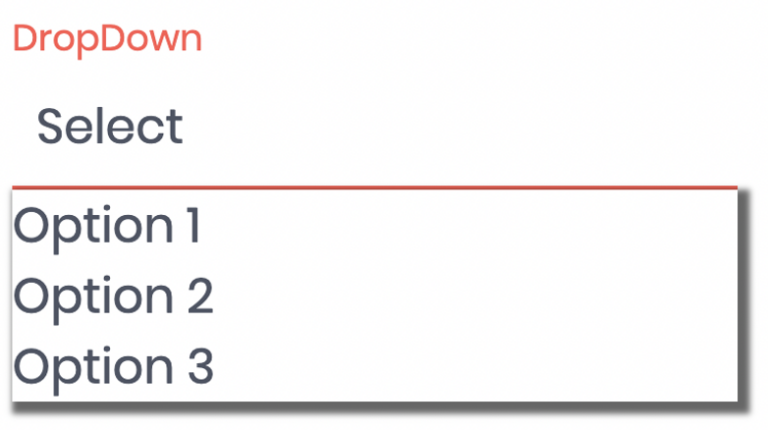
In this sample, you can see how to add your style to the LitElement. If you want to see all the component’s CSS styles, take a look at the StackBlitz demo. After adding the styles, our component looks like this:
How to use properties
We have a template, we have added styles to the Web Component, and we can render it in the browser. But so far, there has been no significant difference in the development compared to native Web Components. That will change now. We want to add properties that we can also use in the template.
To do so, you must declare a static getter with the name properties.
					import { LitElement, html } from 'lit-element';

export class CustomDropDown extends LitElement {
    static get properties() {
        return {
            title: { type: String, reflect: true },
            label: { type: String, reflect: true },
            value: { type: String, reflect: true },
            closed: { type: Boolean, reflect: true },
        };
    }

    // ...
    constructor() {
        super();
        this.title = 'DropDown';
        this.value = 'none';
        this.closed = true;
    }
}
When defining your properties, name them and remeber it is required to set a type like String. If you want to reflect your properties, set the property reflect to true. reflect means converting the property to a HTML attribute (read more about attributes vs. properties here).
In our example, we need properties for the title, the value item, and the state to define whether the dropdown is open or closed. If you implement a static properties getter, initialize your property values in the element constructor. Then we use them in our render method:
					export class CustomDropDown extends LitElement {
    static get properties() {
        return {
            title: { type: String, reflect: true },
            label: { type: String, reflect: true },
            value: { type: String, reflect: true },
            closed: { type: Boolean, reflect: true },
        };
    }

    // ...
    constructor() {
        super();
        this.title = 'DropDown';
        this.value = 'none';
        this.closed = true;
    }

    render() {
        return html`
            <div class="dd-container">
                <div class="dd-label">${this.title}</div>
                <div class="dd-head">
                    <div class="dd-choice">${this.value}</div>
                    <div class="dd-toggle ${this.closed ? 'open' : 'closed'}"></div>
                </div>
                <div class="dd-body ${this.closed ? 'open' : 'closed'}">
                    <div>Option 1</div>
                    <div>Option 2</div>
                    <div>Option 3</div>
                </div>
            </div>
        `;
    }
}
In the sample, it is visible that you can add properties inside the HTML Template, if you are using template literals. If we want to set our options via properties, we can add a new property, like the following:
					export class CustomDropDown extends LitElement {
    static get properties() {
        return {
            title: { type: String, reflect: true },
            value: { type: String, reflect: true },
            closed: { type: Boolean, reflect: true },
            options: { type: Array }
        };
    }

    //...

    constructor() {
        super();
        this.title = 'DropDown';
        this.value = 'none';
        this.closed = false;
        this.options = ['German', 'English', 'France'];
    }
    //...

    render() {
            return html`
                <div class="dd-container">
                    <div class="dd-label">${this.title}</div>
                    <div class="dd-head">
                        <div class="dd-choice">${this.value}</div>
                        <div class="dd-toggle ${this.closed ? 'open' : 'closed'}"></div>
                    </div>
                    <div class="dd-body ${this.closed ? 'open' : 'closed'}">
                        ${this.options.map(option => html`<div class="dd-option">${option}</div>`)}
                    </div>
                </div>
            `;
        }
}
To iterate over the array, we can use the map function. The callback of map also needs to return a tagged template literal with the html tag function.
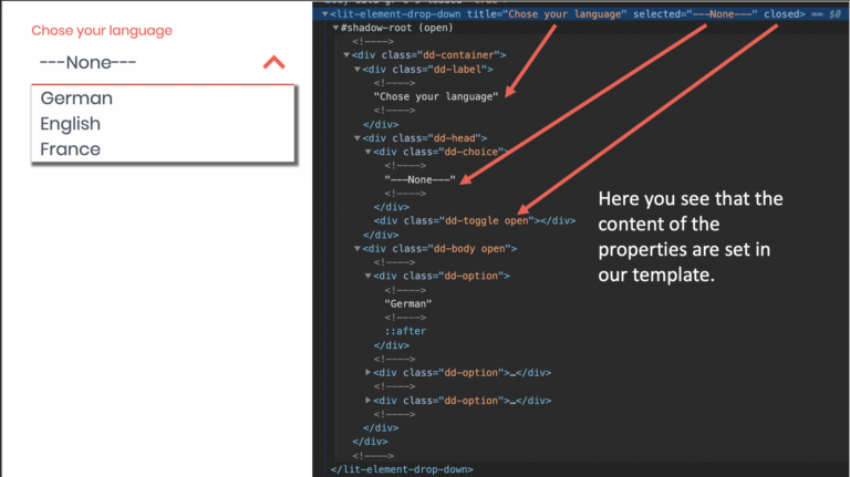
All properties we set in our static getter are also properties of our class.
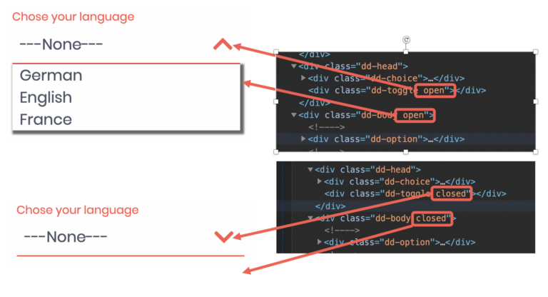
Add actions to your Web Component
The following step is to add actions to our Web Component. We can add an event listener for events like click in our template. For event binding in LitElement the syntax is adding an @ for the event name like @click. In the code below you see that we use the @click event on the div tag with the class name head to toggle the dropdown Web Component.
					// ...

toggleMenu(event) {
    this.closed = !this.closed;
}

render() {
    return html`
        <div class="dd-container">
            <div class="dd-label">${this.title}</div>
            <div class="dd-head" @click="${this.toggleMenu}">
                <div class="dd-choice">${this.value}</div>
                <div class="dd-toggle ${this.closed ? 'open' : 'closed'}"></div>
            </div>
            <div class="dd-body ${this.closed ? 'open' : 'closed'}">
                ${this.options.map(option => html`<div class="dd-option">${option}</div>`)}
            </div>
        </div>
    `;
}

// ...
When we click on the head of our dropdown Web Component now, we invert the closed property, and the CSS class will be changed.
Before we finish our sample, we have to handle the click event on the dropdown options. For that, we add a second click handler, which is for the option click. If the user clicks on an option, the Web Component dispatches a custom event.
					// ...

    handleMenuOption(event, option) {
        this.value = option;
        const customEvent = new CustomEvent('selectionChanged', {
            detail: {
                option: this.value
            }
        });
        this.dispatchEvent(customEvent);
        this.toggleMenu(event);
    }

    render() {
        return html`
            <div class="dd-container">
                <div class="dd-label">${this.title}</div>
                <div class="dd-head" @click="${this.toggleMenu}">
                    <div class="dd-choice">${this.value}</div>
                    <div class="dd-toggle ${this.closed ? 'open' : 'closed'}"></div>
                </div>
                <div class="dd-body ${this.closed ? 'open' : 'closed'}">
                    ${this.options.map(option => html`<div class="dd-option" @click="${(e) => this.handleMenuOption(e, option)}">${option}</div>`)}
                </div>
            </div>
        `;
    }

// ...
In the sample code, you can see that a click event is added to every option. In the handleMenuOption function, the newly selected option, and a new CustomEvent is created. The CustomEvent will be dispatched with the method dispatchEvent.
Let’s take a look back at our index.html file, add some properties, and view our custom event.
<body>
    <lit-element-drop-down
        title="Wähle deine Sprache"
        value="German"
        closed="true"
        options='["German","English","France","Espanol"]'>
    </lit-element-drop-down>

<script src="https://www.thinktecture.com/core/cache/min/1/3eb46dc8686f66d5f61a0ec5cefc02ff.js" data-minify="1"></script></body>
In the sample video, you can see that on every selection, the console logs the new option. If we look into the HTML code, we can also notice the CSS classes toggleing when changing the closed state.
Build & use your Web Component
The last step is to build and package your Web Component. Since there is no standardized approach for building it, you can use any desired tool, like Webpack or Parcel. In my sample, we built the Web Component with Webpack. In order to build it, we use the following webpack.config.js:
					const path = require('path');

module.exports = {
  mode: 'production',
  entry: path.resolve(__dirname, 'src/dropdown.js'),
  output: {
    library: 'LitElementDropDown',
    path: path.resolve(__dirname, 'dist'),
    filename: 'lit-element-drop-down.js',
  },
};
To bundle the Web Component, we have set up a npm script build-wc:
					{
    "name": "lit-element-drop-down",
    "version": "1.0.0",
    "scripts": {
      "build-wc": "npm run build-wc:clean && webpack-cli",
      "build-wc:clean": "rm -rf dist && mkdir dist"
    }
  // ...
}
At last we run npm run build-wc and the Web Component is packaged in the file lit-element-drop-down.js within the dist folder.
To use your Web Component, simply add them to your index.html.
<script type="module" src="../dist/lit-element-drop-down.js"></script>
Summary
With LitElement, you have a good base class for creating fast, lightweight Web Components. It is much easier than ever to develop them because LitElement uses familiar development models. You can use the power of JavaScript in your HTML template. Elements update automatically when their properties change.
LitElement also uses lit-html to define and render HTML templates. DOM updates are lightning-fast because lit-html only re-renders the dynamic parts of your UI. The advantage of using LitElement compared to a framework like Angular is that it is only a base class and not an extensive framework. So you get a package that contains both the Web Component and the framework which leads to a higher parse time.
If you want to learn more about Web Components, take a look at the following articles:
- How to Create a Native Web Component Without a Framework
- Introduction and motivation
- Perks of Web Components
- Faws of Web Components
So try it out, fiddle around, and create your first small Web Components with LitElement. If you want to see the complete code and try out the sample, you can find the demo here.