Visual Testing Of Angular Components With Storybook & Chromatic

In a previous article, From paper sketch to a running application - Adobe XD, Storybook & Angular in action, I described the basics of writing Storybook stories and Angular components. In this follow-up, you will learn to enhance the Storybook workflow through visual testing to achieve fast feedback and development iterations. Not only does visual testing improve the overall quality and stability of your web-based software. The stakeholders also get to see something early, which means that changes are still possible in the developing process.

In diesem Artikel:

kd
Konstantin Denerz ist Software Architekt und Consultant bei Thinktecture mit Fokus auf Angular und der Verbesserung von User Experience.

Use Case

Let’s say we have a mono repository with a core library and some core components that should be used in different Angular applications. One of those components is a button component with a badge notification. In the main branch of our repository, it looks like the screen below.
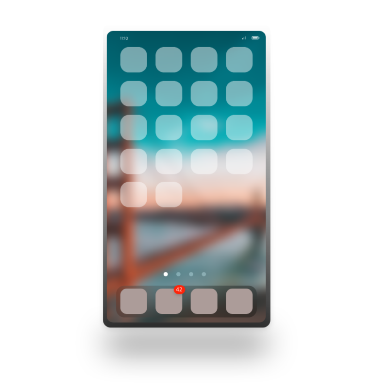
The source code for the sample used in this article is available in this GitHub repo: github.com/thinktecture-labs/article-visual-testing-angular-storybook

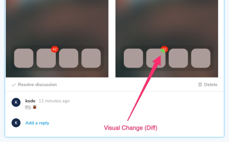
In one of our feature branches, we created new components and changed some CSS variables. Let’s get this bug in the application: the badge notification with the number 42 is now located behind our button, because the z-index is wrong:

It’s just a small visual issue that is hard to find by unit or integration tests. In the best case, the bug will be found and fixed before the rollout. Most likely, it won’t be discovered before.

Manual vs. Automatic Tests of Angular Components

Indeed you can find such a bug by having many human test users. This manual testing requires resources and test plans before each release, though.

Another way is the use of automatic tests. Most developers are already familiar with unit tests, responsible for testing internal low-level logic without dependencies. In our case, we want to write integration tests to test the interaction of several components, like button and badge. Of course, we could set up a test that checks several CSS styles, e.g. to test badge’s z-index and buttons, but these tests would be very long, unreadable, and complicated. Instead, we will write visual tests based on image snapshots.

Visual Regression Tests

Visual tests create an image snapshot of a component in a specific state. In our use case, I made the first image snapshot of the button with the badge and merged it into the main branch before the error has crept in. We call these snapshots baseline.

Each build process in the new feature branches should

  • run the visual tests,
  • create new image snapshots, and
  • compare them against the baseline.

One (commercial) framework that supports this approach is Chromatic.

Visual Regression Tests with Storybook and Chromatic

Chromatic is a platform that offers the following features:

  • The publishing of statically built Storybook web applications (as a collection of components) in the cloud
  • Image snapshot creation (visual test)
  • Review and change request feature

Setup

Add the required Storybook tooling into your repo path if not already installed:


					npx sb init


Install the Chromatic CLI:

				
					npm install --save-dev chromatic


The CLI builds and publishes your Storybook project. We need a project-token for authentication with Chromatic before the CLI can publish the local version on the Chromatic site to see the visual changes. Therefore you have to visit https://www.chromatic.com/start and create a new project based on a project from your linked account (e.g. GitHub, GitLab, Bitbucket), or scratch.

Publish & Run

Now you should see a screen like this:
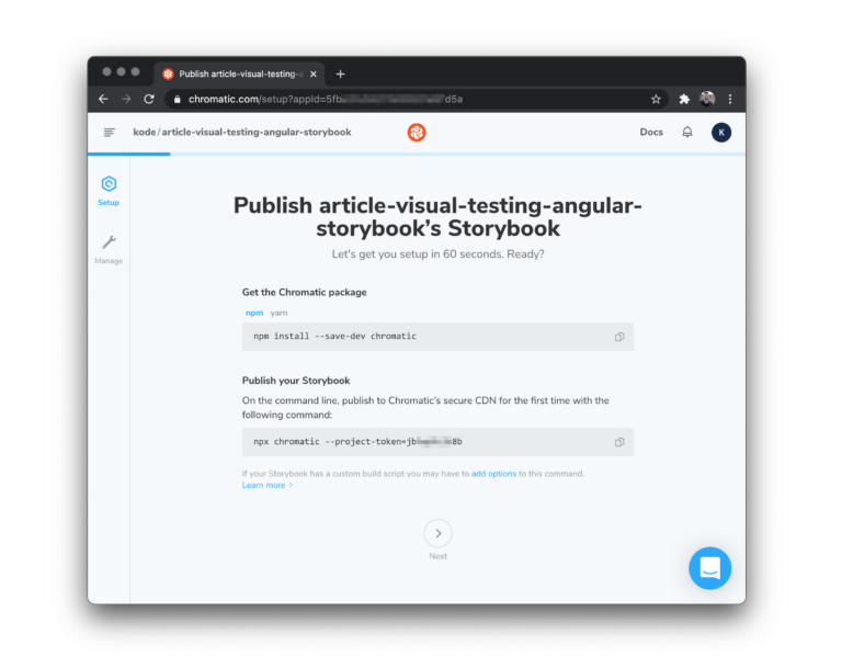
To create the baseline snapshots, we should check out the main branch and build and publish the Storybook project with the following command:

				
					npx chromatic --project-token=PROJECT_TOKEN


The project token in the command above is available on the initial screen or Chromatic’s manage page. The screen below shows the output of the command.
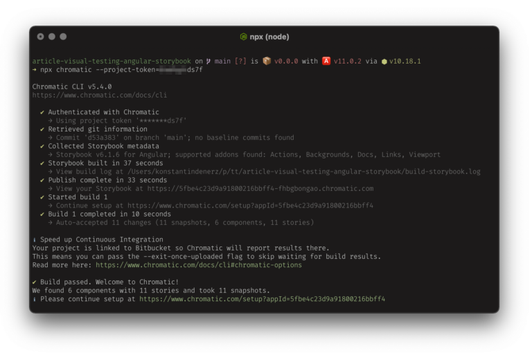
Visual Changes

The next step is to create, for example, a new component in the feature/chip-component branch. After commit and push to the linked version control service, we can create a pull request. This pull request is now visible in Chromatic, but it requires additional action. This action is usually carried out by a continuous integration (CI) build, but we can run it locally, too:

Check out the feature branch if not done yet:

				
					git checkout feature/chip-component


Publish the Storybook from our feature branch:

				
					npx chromatic --project-token=PROJECT_TOKEN


And this is the result we are longing for: now you can review the visual changes and accept or deny them:
Summary

In this article, you saw an easy way for visual testing of Angular components with Chromatic, a commercial product (we are not related to that company in any way, BTW). Of course, you can also do so without Chromatic and, for example, rely on your own implementation. The steps are equal: build Storybook in the feature branch, create image snapshots (on your own with your own tooling), and compare them with the baseline.

Kostenloser
Newsletter

Aktuelle Artikel, Screencasts, Webinare und Interviews unserer Experten für Sie

Verpassen Sie keine Inhalte zu Angular, .NET Core, Blazor, Azure und Kubernetes und melden Sie sich zu unserem kostenlosen monatlichen Dev-Newsletter an.

Newsletter Anmeldung
Diese Artikel könnten Sie interessieren
Angular
sl_300x300

View Transition API Integration in Angular—a brave new world (Part 1)

If you previously wanted to integrate view transitions into your Angular application, this was only possible in a very cumbersome way that needed a lot of detailed knowledge about Angular internals. Now, Angular 17 introduced a feature to integrate the View Transition API with the router. In this two-part series, we will look at how to leverage the feature for route transitions and how we could use it for single-page animations.
15.04.2024
Low-angle photography of metal structure
AI
cl-neu

AI-Funktionen zu Angular-Apps hinzufügen: lokal und offlinefähig

Künstliche Intelligenz (KI) ist spätestens seit der Veröffentlichung von ChatGPT in aller Munde. Wit WebLLM können Sie einen KI-Chatbot in Ihre eigenen Angular-Anwendungen integrieren. Wie das funktioniert und welche Vor- und Nachteile WebLLM hat, lesen Sie hier.
26.02.2024
Angular
sl_300x300

Konfiguration von Lazy Loaded Angular Modulen

Die Konfigurierbarkeit unserer Angular-Module ist für den Aufbau einer wiederverwendbaren Architektur unerlässlich. Aber in der jüngsten Vergangenheit hat uns Angular seine neue modullose Zukunft präsentiert. Wie sieht das Ganze jetzt aus? Wie konfigurieren wir jetzt unsere Lazy-Komponenten? Lasst uns gemeinsam einen Blick darauf werfen.
03.08.2023
Angular
YB_300x300

Using EntityAdapter with ComponentStore: @ngrx/entity Series – Part 3

As someone who enjoys the ComponentStore on an average level, I have written simple reactive CRUD logic several times. While storing a vast number of entities in the component state might not be a frequent use case, I will briefly illustrate the usage of the EntityAdapter with the @ngrx/component-store.
14.02.2023
Angular
YB_300x300

Multiple Entity Collections in the Same Feature State: @ngrx/entity-Series – Part 2

After introducing the @ngrx/entity package, I am often asked how to manage multiple entity types in the same feature state. While I hope that the previous part of this article series has made this more apparent, I will further focus on this question in the following.
07.02.2023
Angular
YB_300x300

Managing Your Collections With the EntityAdapter: @ngrx/entity-Series – Part 1

This three-part series of blogposts is targeted at developers who have already gained experience with NgRx but still manage their collections themselves. In the first part I introduce the Entity Adapter, in the second part I show you how to connect it to NgRx and in the third part how to do it with the Component Store as well.
31.01.2023