
Article Series
Desktop operating systems originally worked with a dark-on-light color scheme. In the meantime, most operating systems have added an option to switch to a light-on-dark scheme, also called dark mode. Especially at night, dark mode is easier on the eyes, and depending on the screen technology, it can even help reduce energy consumption. At around 2019, support for detecting the user’s preference was added to the web platform. The Paint remake also detects if the user is running light or dark mode and adjusts the color scheme user interface accordingly.
Syncing with the Operating System
The prefers-color-scheme CSS media feature indicates which color scheme the user prefers. It can take two values: light, if the user prefers a dark-on-light scheme (or didn’t actively make a decision), and dark, if the user prefers a light-on-dark color scheme instead. Usually, the preference is inherited from the operating system’s settings. If the user’s choice changes during runtime (for example, because the operating system switches between light and dark mode based on time), the change is reflected automatically.
Cascading Through the Shadow DOM
As shown in the first part of this series, the Paint remake makes extensive use of web components: The app itself is a web component, and all its parts, such as the toolbox or color bar, are web components too. All components are using a shadow tree to isolate their style (and structure) from the outside world. However, in the case of paint.js.org, there are values that the components need to share. For instance, the background color (“button face”) should only be defined once in the application’s root and reused throughout the rest of the application.
That’s what CSS custom properties are for (or “CSS variables”, as they are sometimes called). In contrast to all the other style definitions, they can be accessed by subordinate components too. The Paint clone defines the colors of Windows 95’s default scheme exactly once at the level of the application’s root node (paint-app). The following is an excerpt of the actual application’s CSS:
					:host {
  --button-face: rgb(192 192 192);
  --button-light: white;
  --button-dark: rgb(128 128 128);
  --button-darker: black;
  --button-text: black;
}
At this central position, we can now re-define the color scheme in case the user prefers a dark color scheme instead. In this case, the custom properties are simply overwritten with different values (i.e., suitable colors for dark mode):
					@media (prefers-color-scheme: dark) {
  :host {
    --button-face: rgb(64 64 64);
    --button-light: rgb(128 128 128);
    --button-dark: rgb(32 32 32);
    --button-text: white;
  }
}
Additional Techniques to Implement Dark Mode
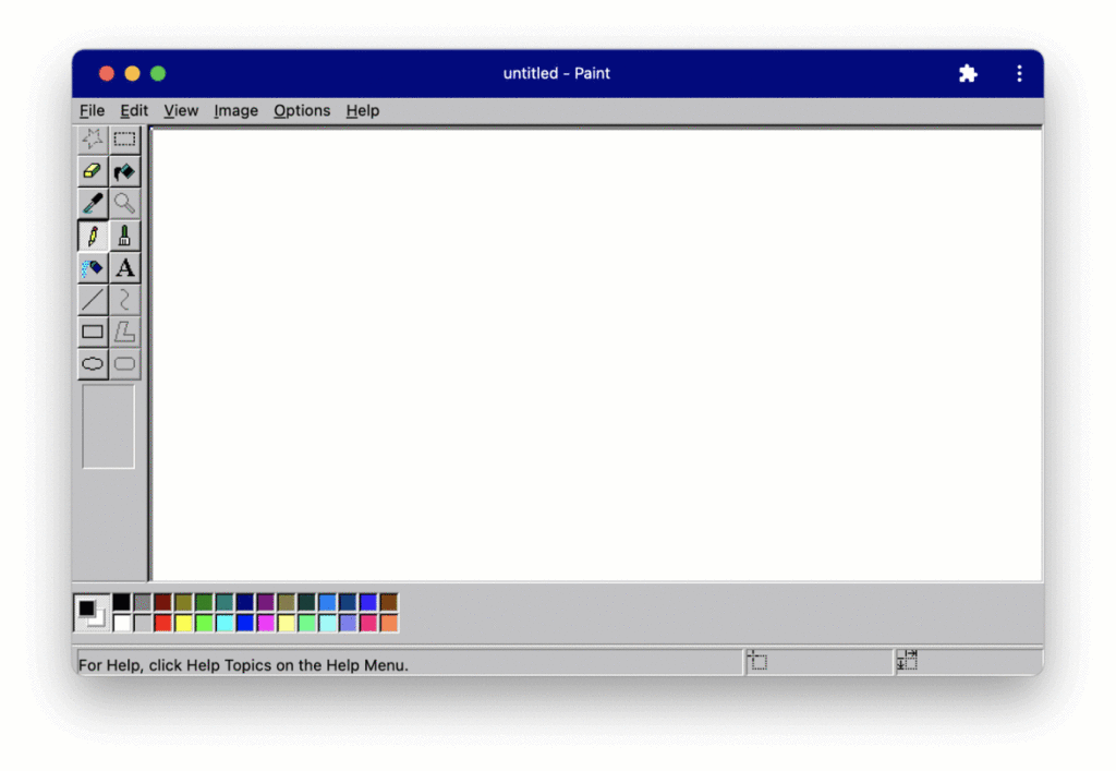
As you can see in the screenshot above, the icons respond to a change of the color scheme as well. I’m using different techniques to achieve this: The toolbox on the left side of the screen shows different parts of one and the same image as the background image of the respective tools. The image used as the background-image is simply swapped with another one containing the icons for dark mode. Other icons of the application, such as the close dialog buttons, are SVGs. For those icons, I’m simply changing the color of their paths.
The prefers-color-scheme media query always resembles the operating system’s setting. If you want to give the user an option to override the setting from within the application, you need to introduce custom CSS classes and set them depending on the user’s choice. By combining the media query and the custom classes, you can start off with the operating system setting and let the user override it during runtime. You can also use the matchMedia() method in JavaScript to listen to changes in the user’s color scheme preference.
As you can see, adding dark mode to your application can be fairly simple. In the case of the Paint remake, there’s no imperative code needed at all. Everything is achieved with the help of the prefers-color-scheme media query and CSS custom properties.