
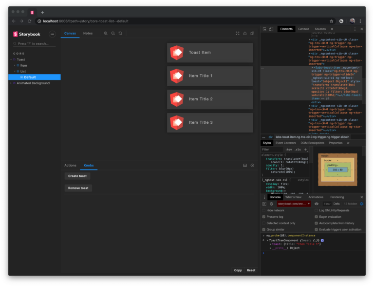
The demo application
Here you can find the demo application in which I add a new toast notification and remove the oldest toast every few seconds.
The repository for the demo is available on our Github team page.
The installation of dependencies with npm i is necessary after cloning. Please run the dev server with npm start and open the URL http://localhost:4200 in the browser. Voila!
Designing and describing the animations
Before implementation, we are taking care of the animation design first. In this step, we should decide which elements we want to change and in what way. Usually, I do this on a piece of paper – or in Adobe XD (UI/UX design tool).
Here is an example:
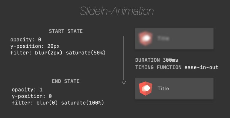
You can see there is a set of properties that describes the initial state (start) and a set for the end state. To achieve a great user experience, we should slow down the changes of properties by defining duration and timing-function.
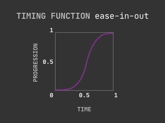
The timing function (ease-in-out in this example) describes the transformation of CSS values over time (duration). This could be a helpful illustration:

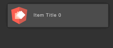
Slide-out animation
This should be used to hide an existing toast (this animation is played with only 10% speed for demonstration purposes).
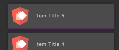
Vertical collapse animation
The third animation shows collapsing the toast item container after hiding a toast. All visible toasts will move up (the toast item container is highlighted for debugging purposes).
Implementing the animations
Now that we know how it should look like, we can start implementing the overall animation.
The demo consists of two components: the ToastItemComponent that represents a single item in the toast list and ToastComponent as the list itself. The animations relate to behaviors like show and hide toast that belong to the list, so we can place the animation definitions in the toast.component.ts.
The @angular/animations package provides a DSL for Web Animations API (WAAPI) which enables us to write JavaScript / TypeScript to implement our animation. An alternative way would be CSS Animations, which is not part of this article. Feel free to get in touch with me if you want to know more about CSS animations.
Let’s take a look at the first animation definition that is placed in toast.component.ts.
We start with the named trigger definition that contains a list of states and transitions.
					// from toast.component.ts
trigger('slideIn', [
  state('*', ...),
  state('void', ...),
  transition('void => *', ...),
]),
States
Each state definition contains a set of CSS styles that will be applied if the state is enabled.
You can define custom state names or use the special transition states like * or void. In our case, it is sufficient to use the built-in states. The void state can be used to define style on the element that should be applied if an element leaves a view. The * state is a fallback that is used when an element enters a view, and no other state is defined (enabled).
The second argument is a function to declare the style metadata object. It contains the style that will be applied to the associated HTML element.
If you remember our animation design above, that is where these properties come from. You can use the same properties as in pure CSS.
					// from toast.component.ts
state('*', style({
    transform: 'translateY(0) scale(1) rotateY(0)',
    opacity: 1,
    filter: 'blur(0) saturate(100%)'
  })
),
Transitions
The transition expects a state change expression that describes when a transition should be used and how. The void => * expression in our slide-in animation says that we apply the transition if the associated element is entering the view, even if it is created in the document object model (DOM). An alias for this is :enter. The corresponding counterpart is :leave. The transition function expects animation metadata with animation duration and timing function
					// from toast.component.ts
transition('void => *',  animate('.3s ease-in-out')),
Enabling animations
Each component that should use animations in its template requires a reference to the definition. For this, we can enter the animation trigger directly in the animations array of the component decorator. I usually move the animation trigger to a separate file to be able to reuse it. One file per animation trigger, like in the verticalCollapseAnimation example below. In my demo-case, the slide-in and slide-out animations are too specific and therefore are stored in toast.component.ts for simplicity.
					// from toast.component.ts
@Component({
  selector: 'labs-toast',
  templateUrl: 'toast.component.html',
  styleUrls: ['toast.component.scss'],
  animations: [
    trigger('slideIn', [
      state('*', style({
        transform: 'translateY(0) scale(1) rotateY(0)',
        opacity: 1,
        filter: 'blur(0) saturate(100%)'
      })),
      state('void', style({
        transform: 'translateY(20px) scale(1.1) rotateY(5deg)',
        opacity: 0,
        filter: 'blur(2px) saturate(50%)'
      })),
      transition('void => *',  animate('.3s ease-in-out')),
    ]),
    trigger('slideOut', [
      state('*', style({
        transform: 'translateX(0)  scale(1)',
        opacity: 1,
      })),
      state('void', style({
        transform: 'translateX(100%) scale(.7)',
        opacity: 0,
      })),
      transition('* => void', animate('.2s ease')),
    ]),
    verticalCollapseAnimation,
    triggerChildAnimation,
  ],
})
export class ToastComponent {
  constructor(public toastService: ToastService) {
  }
}
After the registration of animations, it is necessary to assign an animation to an HTML element. The Angular way of doing this is to declare an attribute with the animation trigger name and the @ prefix.
For instance:
<labs-toast-item @slideIn></labs-toast-item>
The template of the ToastComponent (list) looks like this:
					// from toast.component.html
<div *ngFor="let item of toastService.items$ | async" @verticalCollapse @triggerChildAnimation>
  <labs-toast-item
    [toast]="item"
    @slideIn
    @slideOut>
  </labs-toast-item>
</div>
We use the toastService to provide an array of toast item models. We also use the ngForDirective to iterate over the array and to create the ToastItemComponent and its parent container which is required for collapse animation.
Our toast template contains four animation bindings that apply the styles from * state on each element with a transition when the elements enter the current view. The style at the beginning of the animation is declared in the void state.
Triggering child animations
The slideOut animation is only triggered if we remove an item from the models array because we used * => void state change expression. We would not see slideOut animation unless we use the @triggerChildAnimation. The *ngFor removes the div container from the view, and animations that are only declared on the same element will be visible. This is the default behavior.
In some cases like ours, we want to wait for the animation execution of child elements. To do this I implemented an animation that will be executed immediately on :enter and :leave. Through this animation, the framework waits for the execution of all child animations.
					// from trigger-child.animation.ts
export const triggerChildAnimation = trigger('triggerChildAnimation', [
  transition(':enter, :leave', [animate('0s'), query('*', [animateChild()])]),
]);
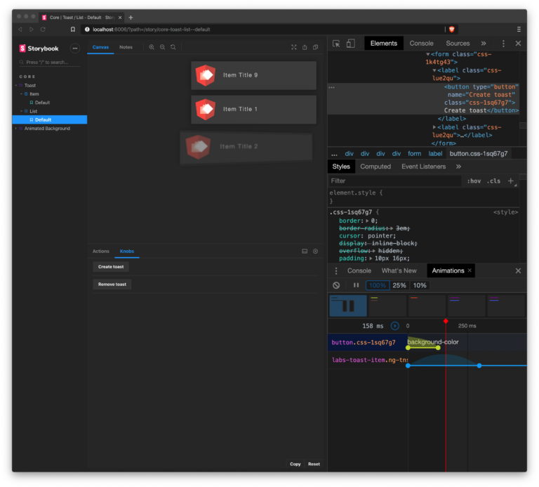
Inspecting animations with Chrome Dev Tools
If you are in an isolated environment (like Storybook) you can use the Inspect Animation tab of the Chrome Dev Tools to slow down and replay your animation. This can be helpful to debug and test your code in some cases.
Summary
With this short insight into my approach for animation development in an Angular business application, I showed that you can define simple animation steps with less code. These animations are relatively easy to combine and improve the user experience of each component – by still being highly performant.