What to expect
- Learn how to create a native Web Component without using a framework
- Explanation of all steps and essentials points like HTML Templates, Custom Elements and shadow DOM to create a Web Component, based on a sample built with Visual Studio Code.

What are Web Components?
Web Components are a collection of three technologies:
- HTML Templates
- Custom Elements
- Shadow DOM
With these three technologies, it is possible to develop native Web Components. For the components part, this may lead us to a solution where we might not need to use full-blown frameworks like Angular, React, or Vue.js.
Create your Web Component template with HTML Templates
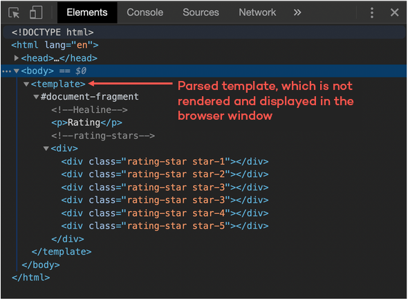
With HTML Templates, you can create your template markup. In order to use a template, you simply have to write your markup inside the <template> tag. But be careful, the template will be parsed but not rendered. This means that the template will appear in the DOM but not be presented in the browser window. Now we start our sample with the HTML Template. In the sample below, we see a template for a simple rating component.
					<template>

    <p>Rating</p>

    <div>
       <div class="rating-star star-1"></div>
       <div class="rating-star star-2"></div>
       <div class="rating-star star-3"></div>
       <div class="rating-star star-3"></div>
       <div class="rating-star star-4"></div>
       <div class="rating-star star-5"></div>
    </div>
</template>
But for our sample, we do not want to write the template in our HTML file. So we create a new JavaScript file rating.js. In this JavaScript file, we add a template tag via code and assign the HTML content to the innerHTML property.
					const template = document.createElement('template');
template.innerHTML = `
<div>

    <p>Rating</p>

    <div class="rating-stars">
        <div class="rating-star star-1"></div>
        <div class="rating-star star-2"></div>
        <div class="rating-star star-3"></div>
        <div class="rating-star star-4"></div>
        <div class="rating-star star-5"></div>
    </div>
</div>
`
Bring your Web Component to life with Custom Elements
With ES6 classes it is possible to create a Custom Element Custom Elements.
The name of your Custom Element must have a dash. In this sample is this <my-rating></my-rating>. Standard browser tags like <body>, <div>, or <video> all come without a dash, so you can easily recognize what a browser element is and what a Custom Element is. To create a Custom Element, you must inherit from the HTML Element or any other HTML Element like HTMLButtonElement.
Create a new Custom Element
Now we create a new class Rating which inherits from HTMLElement and calls the base constructor with the method super inside our own constructor method.
					const template = document.createElement('template');

// ....

export class Rating extends HTMLElement {
    constructor() {
        super();
    }
}
Register your Custom Element
Finally, you need to register your Custom Element. You can do this with one line of code: window.customElements.define('my-rating', Rating);
In the example, the CustomElementRegistry will be called, to define and register the my-rating Web Component as Custom Element in the global window.
					const template = document.createElement('template');

/// …

export class Rating extends HTMLElement {
    // …
}

window.customElements.define('my-rating', Rating);
After the Custom Element is defined, you can use it in your HTML file. To add this Custom Element and use your Web Component, you must import your JavaScript file. Relevant here is that the script file is added with the type module.
					<html>
    <head>

        <script type="module" src="./rating.js"></script>
    </head>
    <body>
       <my-rating></my-rating>
    <script src="https://www.thinktecture.com/core/cache/min/1/58522242862a0602de25872f23b8521a.js" data-minify="1"></script></body>
</html>
The lifecycle model
The lifecycle of a Custom Element has a constructor for the element class and four methods to implement.
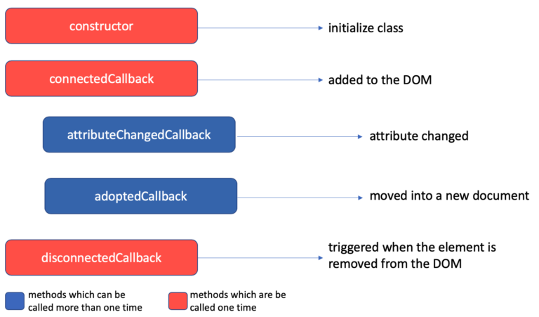
- The first one is the
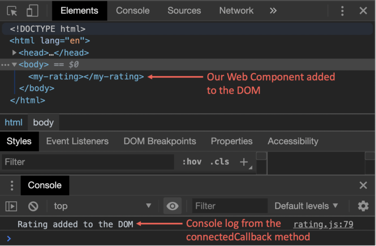
connectedCallback: This method will be called when the Custom Element is attached to the DOM.
<body>
    <my-rating></my-rating>
<script src="https://www.thinktecture.com/core/cache/min/1/58522242862a0602de25872f23b8521a.js" data-minify="1"></script></body>
					// rating.js
connectedCallback( {
    console.log('Rating added to DOM');
}
- Second is
adpotedCallback: This method will be called when the Custom Element is moved to a newdocument.
					//rating.js
adoptedCallback() {
    console.log('Rating was moved into a new DOM');
}
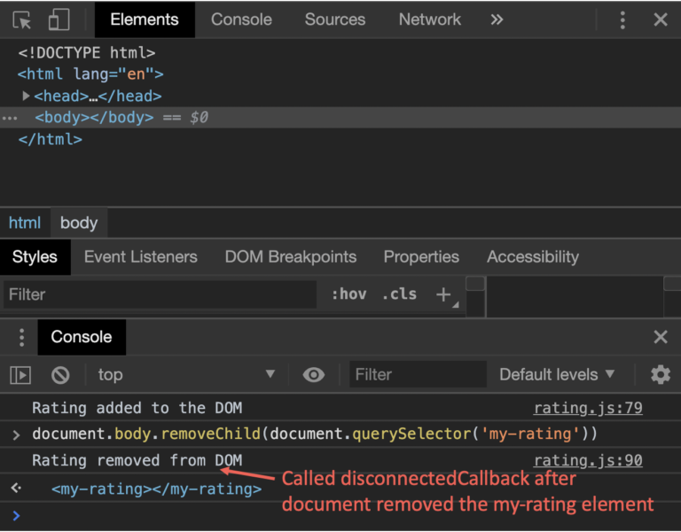
- The third callback method is
disconnectedCallback: This method will be called when the element has been removed from the DOM.
					<body>
    <my-rating></my-rating>

<script src="https://www.thinktecture.com/core/cache/min/1/58522242862a0602de25872f23b8521a.js" data-minify="1"></script></body>
					disconnectedCallback() {
    console.log('Rating removed from DOM');
}
- The last callback method
attributeChangedCallbackneeds a little bit more explanation:
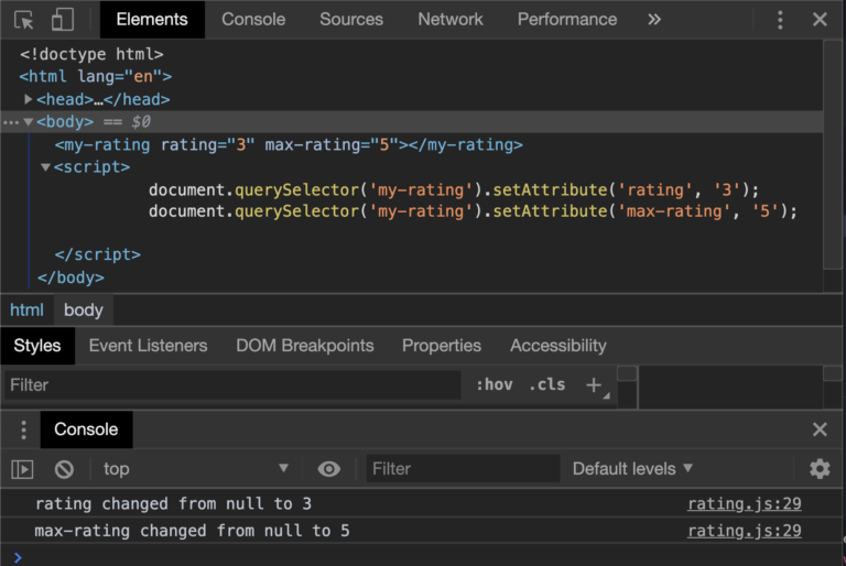
To use theattributeChangedCallback, you have to define your attributes, which you want to listen on. To create your attributes, you have to define a static string array calledobservedAttributes, which contains the attributes’ names. When you have created the array, you can set the attributes on the Custom Element from outside, and theattributeChangedCallbackwill be called.
In the sample, we need an attribute forratingandmax-rating.
					// rating.js
export class Rating extends HTMLElement {
    static get observedAttributes() {
        return [ 'rating', 'max-rating' ];
    }

    constructor() {
     //...
    }

    // then will attibuteChangedCallback will be calles
    attributeChangedCallback(name, oldVal, newVal) {
      if (oldVal !== newVal) {
         console.log(`${name} changed from ${oldVal} to ${newVal}`)
      }
    }
}
					<body>
    <my-rating></my-rating>

<script src="https://www.thinktecture.com/core/cache/min/1/58522242862a0602de25872f23b8521a.js" data-minify="1"></script></body>
Attributes vs. Properties
If you use properties and attributes in your class, you must be careful, because property value is not the same as the attribute value. If you wish to sync them, then you will need to implement it. Let’s demonstrate that with our example:
					//rating.js
export class Rating extends HTMLElement {
    static get observedAttributes() {
        return [ 'rating', 'max-rating' ];
    }

    constructor() {
     //...
    }

    connectedCallback() {
        if (!this.rating) {
            // Set default value to zero
            this.rating = 0;
        }
        if (!this.maxRating || this.maxRating <= 0) {
            // Set default value to five
            this.maxRating = 5;
        }
    }

    get maxRating() {
        // be careful: attributes always string, if you want a number, you must parse it on your own.
        return +this.getAttribute('max-rating');
    }

    set maxRating(value) {
        // if you set the property maxRating in this class, you must sync them with the attribute
        this.setAttribute('max-rating', value);
    }

    get rating() {
        // be careful: attributes always string, if you want a number, you must parse it by your own.
        return +this.getAttribute('rating');
    }

    set rating(value) {
        // if you set the property maxRating in this class, you must sync them with the attribute
        this.setAttribute('rating', value);
    }

    attributeChangedCallback(name, oldVal, newVal) {
      if (oldVal !== newVal) {
        switch(name) {
            case 'name':
                this.rating = newVal;
                break;
            case 'max-rating':
                this.maxRating = newVal;
                break;
       }
     }
   }
}
Encapsulate your Web Component with the shadow DOM
To encapsulate the HTML and CSS from the global scope, we must create our own shadow DOM. With the shadow DOM, we create an isolated DOM, which is not accessible from the outside. CSS styles are scoped to the shadow DOM—no more ID or class conflicts. Also, conflicts with existing IDs or classes are history.
Attach a shadow from an HTML element
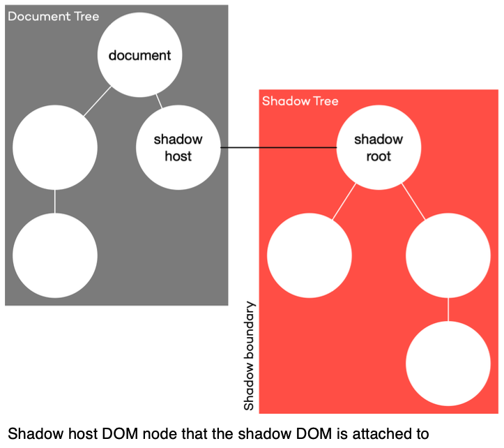
The shadow DOM has the following concepts:
- First of all, there is the shadow host: this is the DOM node that the shadow DOM is attached to
- Second is the shadow tree: this is the DOM tree inside the shadow DOM
- Next is the shadow root: it is the root node of the shadow tree
- The last one is the shadow boundary: here, the shadow DOM will end and the regular DOM begins.
So now, let us attach our HTML Template content to a shadow host.
					//rating.js
const template = document.createElement('template');
// ...

export class Rating extends HTMLElement {
    //...
    constructor() {
        super();
        // attach Shadow DOM to the parent element.
        // save the shadowRoot in a property because, if you create your shadow DOM in closed mode,
        // you have no access from outside
        const shadowRoot = this.attachShadow({mode: 'closed'});
        // clone template content nodes to the shadow DOM
        shadowRoot.appendChild(template.content.cloneNode(true));
    }
    //...
}
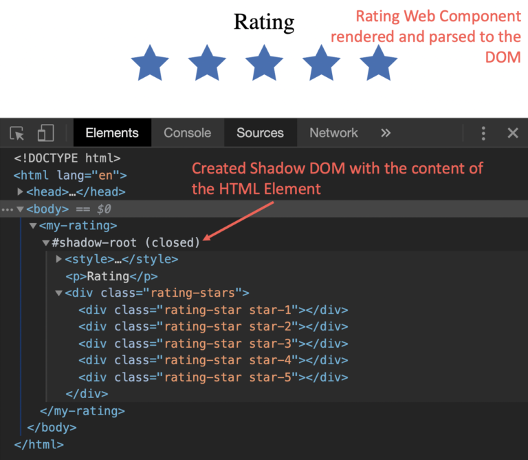
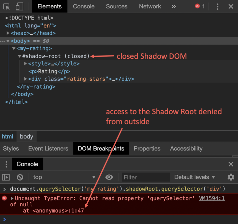
In our sample, you see that the shadow DOM is attached to the Shadow Host, which is the parent element <my-rating>. The method attachShadow has an object as a parameter, where it is possible to set the mode. This mode property can have two values.
- The first one is
open: with thismodethe shadow root is open to the outside and can be called up.
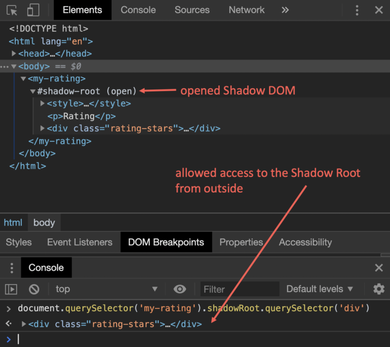
- Second is
closedmode: now, there is no access to the shadow root from outside. If you want to use them, you must initialize a local property, like in the sample below.
					const shadowRoot = shadowHost.attachShadow({ mode: 'closed '});
shadowRoot.querySelector('p');
// -> [HTMLElement]
Get your markup inside a Web Component
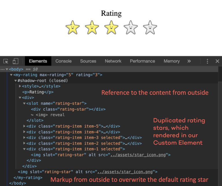
After we have defined a template, created a Custom Element, and attached a shadow DOM, we have all done everything needed to create a Web Component. Now we can have a look at how we bring content from outside, inside our Web Component. Let’s start with markup from outside. To allow markup from outside, we can use slots. Slots have the HTML tag <slot>.
In our sample, we must change a little bit. If we want to have the same count on stars as the max-rating, we have to duplicate our star <div> tag or the star, which comes from outside. So let’s update our template markup.
					// rating.js
const template = document.createElement('template');
template.innerHTML = `
<style>
 // ...
</style>
<p>Rating</p>
<div class="rating-stars">
    <slot>
        <div class="rating-star"></div>
    </slot>
</div>
`;
What has changed in the HTML Template:
- removed all
<div>tags with the classrating-starbut one. - write the one
<div>tag inside a new<slot>tag.
The next step is to render all rating stars.
					export class Rating extends HTMLElement {

    //...

    constructor() {
        super();
        const shadowRoot = this.attachShadow({mode: 'closed'});
        shadowRoot.appendChild(template.content.cloneNode(true));
        // assign the div content to a class variable
        this.element = shadowRoot.querySelector('div');
        const slot = this.element.querySelector('slot');
        // assign the rating star to a class variable, that the render class can duplicate them
        this.slotNode = slot.querySelector('div');
        slot.addEventListener('slotchange', event => {
            const node = slot.assignedNodes()[0];
            if (node) {
                // assign the new node to the slotNode and render the new stars
                this.slotNode = node;
                this.render();
            }
        });
    }

    // ...
}
What has changed in the Custom Element:
- Assign the content of the first
<div>element - Assign the content of the
<slot>tag to a class variableslotNode, that the new methodrenderhas access to them. - The new method
render()was created: the method duplicates the<div>tag as many times as themax-ratingattribute indicates.
The last step is that we have to register for the event slotchange to find out when a slot has changed. The event will be thrown every time the content of a slot has been changed. With the function assignedNodes(), we can get the actual content.
					export class Rating extends HTMLElement {

    //...

    constructor() {
        super();
        const shadowRoot = this.attachShadow({mode: 'closed'});
        shadowRoot.appendChild(template.content.cloneNode(true));
        // assign the div content to a class variable
        this.element = shadowRoot.querySelector('div');
        const slot = this.element.querySelector('slot');
        // assign the rating star to a class variable, that the render class can duplicate them
        this.slotNode = slot.querySelector('div');
        slot.addEventListener('slotchange', event => {
            const node = slot.assignedNodes()[0];
            if (node) {
                // assign the new node to the slotNode and render the new stars
                this.slotNode = node;
                this.render();
            }
        });
    }

    // ...
}
So now, we can change the rating stars from default to our rating star.
					<body>
    <my-rating>

        <img decoding="async" src="data:image/svg+xml,%3Csvg%20xmlns='http://www.w3.org/2000/svg'%20viewBox='0%200%200%200'%3E%3C/svg%3E" alt="" data-lazy-src="../assets/star_icon.png" /><noscript><img decoding="async" src="../assets/star_icon.png" alt="" /></noscript>
    </my-rating>
<script src="https://www.thinktecture.com/core/cache/min/1/58522242862a0602de25872f23b8521a.js" data-minify="1"></script></body>
If we want to overwrite more than one item in our template, we must give the <slot> tag a name attribute.
					const template = document.createElement('template');
template.innerHTML = `
<style>
 // ...
</style>
<slot name="rating-title">
    <p>Rating</p>
<slot>
<div class="rating-stars">
    <slot name="rating-icon">
        <div class="rating-star"></div>
    </slot>
</div>
					<my-rating>
    <p slot="rating-title">New Rating Title</p>
    <img decoding="async" slot="rating-icon" src="data:image/svg+xml,%3Csvg%20xmlns='http://www.w3.org/2000/svg'%20viewBox='0%200%200%200'%3E%3C/svg%3E" alt="" data-lazy-src="../assets/star_icon.png" /><noscript><img decoding="async" slot="rating-icon" src="../assets/star_icon.png" alt="" /></noscript>
</my-rating>
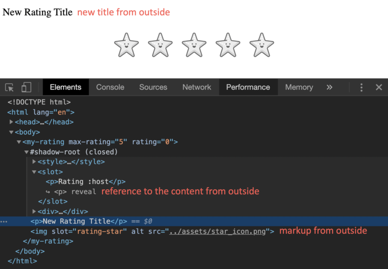
What is striking here is that the title adopts the style from the outside and ignores the style of the Web Component. In the next passage, we have to look at how we can fix this and how we can adapt the style in a specific context.
How to style your Web Component
Let us take a look at how we can have access to the styles inside the Web Component.
Inside the shadow
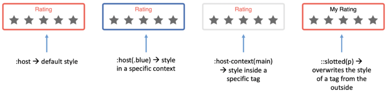
To style the host of the Web Component, we have four options (see here):
:host-> Selects the shadow host element.:host(context-name)-> Selects the shadow host element only if it has a certain class.:host-context(context-tag-name)-> Selects the shadow host element only, if the selector given as the function’s parameter matches the Shadow Host ancestor(s) in the place it sits inside the DOM hierarchy.::slotted()-> Selects a slotted element if it matches the selector.
To illustrate this, you will see a small example below, which shows how a Web Component looks in a specific context.
<template>
    <style>
        /* default style */
        :host {
            border-color: #ff584f;
        }
        /* style in a specific context */
        :host(.blue) {
            border-color: #3d6fb4;
        }
        /* style inside a specific tag */
        :host-context(main) {
            border-color: #21242d;
        }
        /* style for slotted tags from outside  */
        ::slotted(p) {
            text-align: center;
        }
        /* ... */
    </style>

</template>


<body>

    <my-rating>
    </my-rating>

    <my-rating class="blue">
    </my-rating>

    <main>
        <my-rating>
        </my-rating>
    </main>

    <my-rating>
        <p slot="rating-title">My Rating</p>
    </my-rating>
<script src="https://www.thinktecture.com/core/cache/min/1/58522242862a0602de25872f23b8521a.js" data-minify="1"></script></body>
CSS Shadow Parts
If you want to style your Web Component from outside, you can set the CSS shadow Part ::part(). Also, let us take a look at this in our sample.
<template>
    <slot name="rating-title">
        <p part="title">Rating</p>
    <slot>
    <div class="rating-stars">
        <slot name="rating-icon">
            <div class="rating-star"></div>
        </slot>
    </div>
</template>


<head>

    <style>
        my-rating.styled::part(title) {
            text-align: center;
            color: #3d6fb4;
            text-decoration: underline;
        }
    </style>
</head>
<body>
    <my-rating class="styled">
    </my-rating>
<script src="https://www.thinktecture.com/core/cache/min/1/58522242862a0602de25872f23b8521a.js" data-minify="1"></script></body>
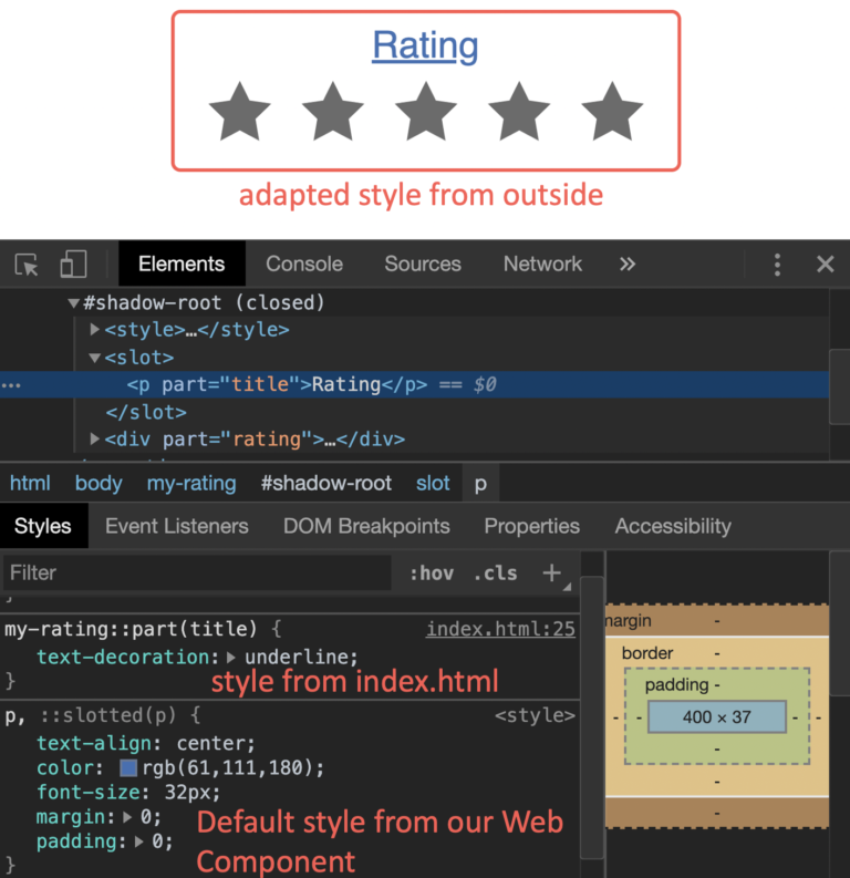
In the sample above, you can see that the style for the title comes from outside and overwrites the style inside the Web Component.
Build a Web Component package
The last step is to build your Web Component. Since there is no standardized approach to build it, you can use any tool you desire, like Webpack or Parcel, for instance. In my sample, I built the Web Component with Webpack. To build my Web Component, I use the following webpack.config.js
					module.exports = {
    mode: 'production',
    entry: {
        'rating': './src/rating.js',
    },
    output: {
        filename: 'my-rating.js',
    },
    ...
};
- In section
entryI set the file path to my Custom Element class. - In section
outputI set the filename for the bundle file.
To bundle the Web Component, I have set up an npm script build-wc:
					{
  "name": "web-component-demo",
  "version": "1.0.0",
  "scripts": {
    // ...
    "build-wc": "npm run build-wc:clean && npm run build-wc:webpack",
    "build-wc:clean": "rm -rf dist && mkdir dist",
    "build-wc:webpack": "webpack"
  }
  // ...
}
At least I run npm run build-wc and, the Web Component is packaged in the file my-rating.js in the dist folder.
Conclusion
In this article, we have looked into the world of Web Components based on a sample component. Web Components consist of the three specifications Custom Elements, shadow DOM, and HTML Templates. If we combine these specifications, it is possible to create own HTML elements that also hide their implementation details from their environment and encapsulate them. This makes it possible to create components that can then be reused in other applications. When taking a look at the statistics of Can I Use on Custom Elements, shadow DOM and HTML Templates, it will become apparent that all three features already arrived in modern browsers like Chrome, Safari and Edge.
To get a little bit more help to build Web Components and get a bit more browser compatibility, you can use LitElement. LitElement is a simple base class from the Polymer Project to create fast and lightweight Web Components.
So try it out, fiddle around with them, and create your first small Web Components for your application. If you want to see all the code and try out the sample, you can find the demo here.