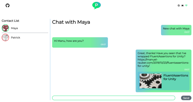
Sample Project: Palaver
In this article, we are using the Palaver sample project, just as we did in the first part of the Web Components series.
Palaver uses several frameworks:
- native Web Components without a framework
- Stencil.js (1.3.0)
- Angular Elements (9.1.7)
- LitElement (2.2.1)
- React (16.9)
- Vue.js (2.6.10)
Sample Project: Project Structure
Before we dive into how to actually create Web Components with each of the modern SPA frameworks, let us take a look at the general project structure. The following folder tree shows a high-level overview of Palaver.
					palaver
|-- docker-build-all.sh
|-- docker-push-all.sh
|-- npm-i.sh
|-- backend
|-- frontend
    |-- package.json
    |-- apps
    |   |-- ng-chat-app
    |-- dist
    |-- web-components
        |-- angular-chat-window
        |-- lit-element-chat-link
        |-- native-web-components
        |-- react-contact-list
        |-- stencil-components
        |-- vue-login
You can think of this project being a mono-repository for several individual projects. For that, you need some scripts to automate the tasks. You can either do it directly with shell scripts, which we did, or you can use specialized tools like lerna or lage.
The npm-i.sh will install all npm packages for each project in one go. The docker-build-all.sh and docker-push-all.sh scripts build the public-facing artifacts of the project using Docker and a Dockerfile. That is the backend (Node.js) and the Angular frontend located in frontend/apps/ng-chat-app. None of the Web Components projects are published and hosted somewhere. That would also be a scenario if that makes sense for your use case. However, in the demo, we decided to only deploy the public-facing projects as mentioned. If you are curious, you can also check out Travis CI, which builds and deploys everything.
Backend
The backend folder contains the backend for the whole project. It is written in pure JavaScript and uses socket.io for the real-time communication part for the chat. It also contains a necessary Dockerfile to build and run the backend, which is deployed to an Azure Web App for Containers.
Frontend
The frontend folder contains all the Web Component projects as well as the host application, that pulls together all Web Components and provides the necessary services to access the backend. The frontend/package.json file contains the tasks to build each Web Component project individually and outputs their build artifacts into the dist folder. It deletes the dist folder before copying the build artifacts, so no old and unused files will be kept.
The web-components folder contains all Web Component projects. Each folder is a project itself, like you, would expect it in a single project repository. They contain their own package.json, .gitignore, README.md, and further. In fact, you would be able to grab each folder and put them into their own repository, if you want to.
Common Commands for Web Component Projects
Each Web Component project has a npm start and npm run build-wc command. The first one will start the development environment of each Web Component. The idea is to develop each Web Component in a sandbox environment, and later build it for usage in other applications. That makes it easy and fast to iterate a single Web Component without having to run a whole project that uses them. For instance, if you run npm start in the react-contact-list folder, the default React development environment starts. If you run npm start in the angular-chat-window folder, the default Angular CLI development environment starts.
The second command, npm run build-wc, creates the actual Web Component. For instance, in the angular-chat-window, it will wrap the Angular component with Angular Elements. The Vue.js component is wrapped with @vue/web-component-wrapper. It is crucial to know, that the current build command builds the Web Component for production. That means, that no source map is present, which could make it hard to debug the Web Component when it is used in the final application. However, that is only part of this demo application. If there is a need for building a debug version of the Web Components, the package.json needs to be extended with those tasks. Pull requests are welcome. 🙂
Additionally, in frontend/package.json there is also a npm run build-wc command. This command will build all individual Web Component projects and copy the build artifacts into frontend/dist.
Common Commands for App Projects
The folder frontend/apps contains all public-facing applications. At the time of writing this article, it only contains a typical Angular (CLI) project. The package.json contains an additional npm run wc command. That command will copy all the build artifacts from frontend/dist into frontend/apps/ng-chat-app/assets/web-components. Likewise, it’s a simulation of the node_modules folder. In a typical project, where several teams develop several apps and Web Component projects, it is likely, that the build artifacts are published as a npm package.
Workflow
For the workflow, you usually would npm start on of the apps (e.g. frontend/apps/ng-chat-app) and then npm start on of the web components you want to work on. Note, all Web Components projects in Palaver are hosted on their own port, so you could start them all at once if you want. When you have done your changes to your Web Component, you do cd frontend and run npm run build-wc && (cd apps/ng-chat-app && npm run wc). The command will first build all web components (in fact, you could build each one individually, just take a look at frontend/package.json), and then copy all components into the app.
Currently, there is no watch job or something to do that automatically. Depending on how you work, you would not need it, since the web components are developed within the own sandbox environment and defining an interface (e.g. HTML attributes). If done, then the web components are build and copied. Having a watch job, however, would automatically deploy the changed Web Components to the apps, so their reload mechanism will then take care. Same here: Pull requests are welcome. 🙂
Creating Web Components with the 'Big Three'
After understanding the structure, commands, and workflow of Palaver, let us see how to create Web Components when using a modern SPA framework. In this section we are covering the creation of Web Components with Angular, React, and Vue.
Disclaimer: I am an Angular developer, neither a React nor Vue developer. By that, the shown code for React or Vue will have room for improvement. If you have good suggestions on how to improve it, let me know. I will be happy to update the code as well as this article!
Angular Elements
To create a Web Component with Angular, you should use Angular Elements. It allows you to wrap any component you have created into a Web Component. To do so, you simply adjust your AppModule (or whatever your Angular root module is called) or create a library for your Web Components. In Palaver, we are using the AppModule.
Here is the relevant code to create a Web Component:
					// other imports ...
import { createCustomElement } from '@angular/elements';

@NgModule({
  declarations: [
    AppComponent, // Debug
    ChatWindowComponent,
    TimestampFormatPipe,
    ChatMessageComponent,
    MessageOrderByTimestampPipe,
  ],
  imports: [ BrowserModule ],
  providers: [],
  schemas: [CUSTOM_ELEMENTS_SCHEMA], // Debug
  bootstrap: environment.production ? [] : [AppComponent],
  entryComponents: [ChatWindowComponent],
})
export class AppModule implements DoBootstrap {
  constructor(private readonly injector: Injector) {
  }

  ngDoBootstrap() {
    if (environment.production) {
      const chatWindowCustomElement = createCustomElement(ChatWindowComponent, { injector: this.injector });
      window.customElements.define('angular-chat-window', chatWindowCustomElement);
    }
  }
}
The lines marked with // Debug are only necessary since we use the same module for the creation of the Web Component as well as for the demo environment. If you create a library only containing the components for the Web Components you can safely remove the marked lines.
As you can see in the code sample, you declare a typical Angular module with its declarations, imports and possible providers. Then, you have to adapt the bootstrap property, if you use one module for demo and Web Component generation. In the bootstrap property, you bootstrap the AppComponent if the environment is not production. The AppComponent is used to develop the ChatWindowComponent. In a production environment, the module shall not bootstrap a component, hence the empty array.
The next step is to define an entry component that Angular can load imperatively, due to the fact, that this component is not referenced elsewhere in the code. Remember, that in production the AppComponent is not part of the final output, that is why the ChatWindowComponent is not referenced as well. That would lead to removing its code in the tree shaking process. However, we want to keep that component, so we have to define it as an entry component.
Additionally, we have to implement the DoBootstrap interface. In the interface implementation we call createCustomElement, which is imported from @angular/elements. The first parameter defines the Angular component that should be wrapped as a Web Component. The second parameter defines an option object, which wants the injector to be set. Without it, you can use anything which would require the injection of a token, like services. The result of createCustomElement is a class, that can be used to create the actual Web Component using the browser’s customElements.define-API.
Et voila. We have created a Web Component using Angular Elements. It is also possible to define more than one Web Component per module. Just repeat the code for each Angular component, that should be wrapped into a Web Component.
Build Process
Per default, if you build the Angular application via the CLI, you get several output files, like main.js, vendor.js, and so on. For easier distribution, a single file would be better. We could either use ngx-build-plus or go for a simple manual approach. For a real project, we suggest taking a closer look at ngx-build-plus. For Palaver, and to get you hands dirty, we have decided to go for a manual approach.
Taking a look at the frontend/web-components/angular-chat-window/package.json, there are two tasks, that create a single file for distribution:
					{
  "scripts": {
    "build-wc": "ng build --prod && npm run build-wc:bundle",
    "build-wc:bundle": "cat dist/angular-chat-window/runtime.*.js > dist/angular-chat-window.js && cat dist/angular-chat-window/polyfills.*.js >> dist/angular-chat-window.js && cat dist/angular-chat-window/main.*.js >> dist/angular-chat-window.js"
}
}
The build-wc script builds a production version of the project. Then it calls build-wc:bundle which simply merges the file runtime.js, polyfills.js and main.js into angular-chat-window.js.
Please note, that neither this build process nor ngx-build-plus, does process additional asset files, which are not part of the compilation (e.g. if you put them into the assets folder). if you need the assets as well, you either need to copy them manually, or check, if you can include them into the compiled output via a webpack loader.
Now, our Angular Elements Web Component is ready to use!
Vue
How to create a Web Component with Vue? Vue provides a @vue/web-component-wrapper for the creation of Web Components. It is really straight forward to use.
All you need to do is to adapt your build process. For a typical Vue component, there is nothing else to do. However, you should take a look at the Interface Proxying Details which lists some special things Vue does when wrapping a component (e.g. casting boolean and number values to their type).
For the build process itself, you simply need a task like this (see frontend/web-components/vue-login/package.json):
					{
  "scripts": {
    "build-wc": "vue-cli-service build --inline-vue --target wc --name vue-login ./src/components/LoginForm.vue"
  }
}
With the installation of @vue/web-component-wrapper your vue-cli-service gets a new target named wc. So you simply call the build service, with --target wc, specify the --name vue-login (which is the Web Component HTML tag later for usage) and point it to the *.vue component file you want to wrap. In our case that is the ./src/components/LoginForm.vue. Per default, the vue-cli-service build does not include the Vue framework itself in the build output, so the host needs to load Vue. If you want to change that to have a self-contained single file deployment version of your component, you need to specify --include-vue.
After running the command, you get a single JavaScript file named vue-login.js, that registers a Web Component <vue-login></vue-login>.
React
Last but not least, we have to talk about React. At the time of writing, there is no official support in React to create Web Components. But using Web Components in React works well.
So, if you want to create a Web Component from React, there are several community projects trying to provide a wrapper. At the time of the creation of Palaver, none of them worked well. That is why we have decided to create our own wrapper, that can be found at frontend/web-components/react-contact-list/src/custom-element.js. My colleague Konstantin Denerz and me worked on that wrapper. It is far away from being production-ready and has its flaws (later more), but it worked well enough for our demos. Remember the disclaimer, that we both are not React developers. Pretty sure that someone with more in-depth knowledge of React would be able to solve our current flaws.
Custom Element Wrapper
Let us take a look at the custome-element.js file:
					import React from 'react';
import ReactDOM from 'react-dom';

export default function defineElement(Component, elementName, observedAttributes = [], events = []) {
  class CustomElement extends HTMLElement {
    constructor() {
      super();
      observedAttributes.forEach(property => Object.defineProperty(this, property, { set: value => this.setterProxy(property, value) }));
      this.events = events;
    }

    setterProxy(name, value) {
      this.attributeChangedCallback(name, value, value); // Careful, this is a bug, since the oldVal always equals the new val
    }

    connectedCallback() {
      const props = [...this.attributes].reduce((props, attribute) => ({ ...props, [attribute.name]: attribute.value }),
        { root: this });

      const instance = (<Component {...(props)} />);
      this.assignEvents(instance);
      ReactDOM.render(instance, this);
      this.instance = instance;
      this.props = props;
    }

    attributeChangedCallback(name, oldValue, newValue) {
      const { instance } = this;
      if (!instance) return;
      const newProps = { ...(this.props), ...({ [name]: newValue }) };
      const newInstance = (<Component {...(newProps)} />);
      this.assignEvents(newInstance);
      ReactDOM.render(newInstance, this);
      this.instance = newInstance;
      this.props = newProps;
    }

    assignEvents(instance) {
      this.events.forEach(event => instance.props[event] = eventArgs => this.dispatchEvent(new CustomEvent(event, { detail: eventArgs })));
    }
  }

  CustomElement.observedAttributes = observedAttributes;
  window.customElements.define(elementName, CustomElement);
}
That monster of a file is basically what is behind Angular Elements and @vue/web-component-wrapper. Let us step through this file from top to bottom.
At first, we create a new function defineElements. It needs several parameters. The first one is the React component that should be wrapped into a Web Component. The second one is the name of the Web Component. The last two optional parameters define the attributes that should be observed, and the events that should be bound to the React component.
The function defineElements then creates a new class that extends from HTMLElement, as any Web Components needs to do. In the constructor of the class, we iterate through the observedAttributes and define them via Object.defineProperty on the class itself. However, we proxy the set function, which is called when setting a property on the class. Within the proxy, we call this.setterProxy which then invokes the Web Component’s attributeChangedCallback API. Here is also the first disadvantage: the attributeChangedCallback is usually invoked with the name of the changed property, its old and its new value. However, in our wrapper, we do not track the old value, so we call the callback only with the new value.
After that, we define the connectedCallback which is a browser API, that is executed when the Web Component is placed in the DOM. In the function, we create an object with all the set attributes on the element, so they will be bound to the React component. Take care, that this binds any defined attribute on the Web Component to the React component.
Next, we create the actual React component with JSX syntax const instance = (<Component {...(props)} />); and place all the attributes on the component. Then, we assign all the defined events on the component using the assignEvents method. In this method, we simply iterate through the events and create an event handler on the React props. The handler itself will simply invoke the dispatchEvent API and create a CustomEvent. By that, you can use events like you are used to in React and the wrapper transforms it into a custom event. After assigning the events, we use ReactDOM.render to render the actual component into the DOM.
Now, we need to take care if attributes change on the Web Component. To do so, we need to implement attributeChangedCallback. In here, and this is the next flaw, we simply re-create the React component. It would be much better if the component could be re-used instead of re-created when a single property changes. This is the part where someone with more knowledge of React could improve this wrapper significantly.
Last but not least, we need to set the static observedAttributes on the class, which is the browser’s API to know, which attribute it should observe and invoke the attributeChangedCallback. Then, we finally can use customElements.define to define the custom element.
Hooray! Let’s talk about the build process!
Build Process
As in all projects, the frontend/web-components/react-contact-list/package.json defines several scripts:
					{
  "scripts": {
    "build-wc": "npm run generate-wc && npm run package-wc",
    "generate-wc": "cp src/WebComponents.js src/index.js && GENERATE_SOURCEMAP=false react-scripts build",
    "package-wc": "rm -rf dist && mkdir dist && cat build/static/js/runtime-main.*.js > dist/react-contact-list.js && cat build/static/js/*.chunk.js >> dist/react-contact-list.js && cp build/static/css/main.*.css dist/react-contact-list.css"
  }
}
The first script build-wc just calls two other scripts sequentially. The script generate-wc compiles the Web Components. The project uses react-scripts for building. Unfortunately, react-scripts has a predefined entry point src/index.js that can not be changed easily (one possibility would be to eject the whole react-script or use a community package that does some strange stuff). So, to stay simple, we copy a src/WebComponents.js and override the existing src/index.js, so our script can be used as the entry point. We will take care of the src/WebComponents.js in a moment. After copying, we call react-scripts build to run the build process.
The next script package-wc is basically the same we have seen the Angular Elements section. It merges the generated files into a single file for deployment. In our case, it merges all JavaScript files into react-contact-list.js and all CSS files into react-contact-list.css.
To finish the React part, we need to take a look at the src/WebComponents.js file, which is as simple as here:
					import defineElement from './custom-element';
import { ContactList } from './contact-list/ContactList';

defineElement(ContactList, 'react-contact-list', ['headerText', 'contacts'], ['onContactSelected']);
Conclusion
In this article, we have seen how the three big and modern SPA frameworks can be used to create Web Components. Some of them had a direct supported way to so do, while other frameworks need some more dedication. However, it is a good thing, that we can use any of the frameworks and use the tools we love to make a further step for Web Components. But, using a SPA framework to create Web Components comes at the cost of file size. To make sure, within your component you can use the framework like it is expected to, each Web Components needs to ship the SPA framework itself (remember --inline-vue). The developers of the frameworks make good progress to get their frameworks smaller with better tree-shaking processes. It will still take some more time until a Web Component built by a SPA framework is small enough to have very little impact on download and parsing times. There are other techniques to counter that, for example by not including the SPA framework in each Web Component, so the host has to load each framework once.
If you still think, that the produces output is too big for your Use Case, you may want to take a closer look at tools like StencilJS or LitElement. For example, Palaver with all of its used frameworks currently ships almost 12 MB. That is way too much for such a simple application, but we will get there someday.
Happy Coding!