
The demo application
An interactive live demo tells more than a thousand words. Here you can find the demo application and all Storybook stories demonstrating all ideas, concepts, as well as the code shown in this article.
The repository for the demo code is available on our Github team page.
As the demo is based on several node packages, the installation of dependencies with npm i is necessary after cloning. Please run the Storybook with npm run storybook and open the local URL http://localhost:6006 in your browser. Voila!
First ideas: Paper sketch
In various discussions with customers about requirements for a new application, I try to sketch user interface ideas to visualize different views of the possible target application. An important part of this step is to figure out the content that the user should see and to group it logically within the UI. In the next step, the content groups should be separated by screens, pages, or dialogs to avoid overloading the user interface.
In the end, we have different sketches like the following one on paper, flip chart, or whiteboard:
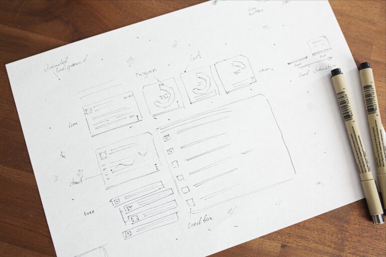
You can see a dashboard screen with different UI elements, like document cards, measure cards, app header, and a document tree.
In some projects, I like to use an iPad to create sketches and share my ideas:

After having a rough vision of where I want to go, I move to Adobe XD to design the screen.
Materializing sketches: Designing components in Adobe XD
In the past, I used a lot of tools to create visual designs: Photoshop, Gimp, Inkscape, Sketch, and so on. Finally, I have ended up with Adobe XD.
It a great designing and prototyping tool and works with SVGs and components. You can create a component with different states and describe the transition between states. A clickable and recordable preview enables the demonstration of the animated prototype. Another central feature is to share the clickable and animated prototype, for instance with co-workers or customers. XD creates an unique link to your prototype, that is deployed as a web application. Of course, this link can be password protected.
If you want to know more about XD, you can find a feature list here: Adobe XD – Features
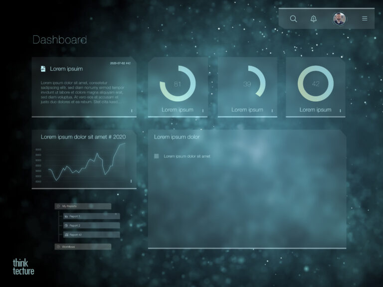
Here is the Adobe XD – Shared Prototype of the dashboard draft.
Designing the dashboard with contents and groups from the sketches is a fast way to visualize the UI and test the user experience in an early project phase. Redesigning designs is easier than refactoring code, so I am going iterative in XD.
In the first step, I create an artboard that stands for a specific screen size – iPad screen size in my case.
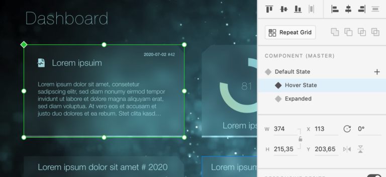
The document card component is the first component I created in XD. You can see three component states in the panel on the right side.
The following video shows the transition between default, hover, and expanded state.
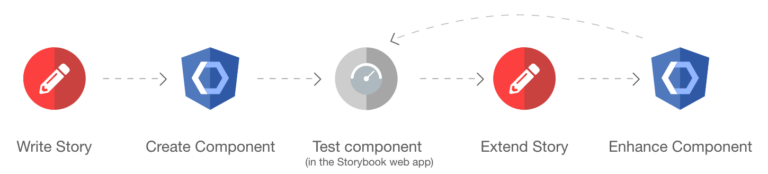
Let's code: Developing components in Storybook
After designing the first components, we could start implementing them. In the early phase of a project, it is an advantage to develop in an isolated environment. Isolation here refers to authentication, backend APIs, databases, and further. Storybook provides exactly this feature. You can write small pieces of code to describe a component in specific states.
Setup
We have to set up some things before we can start developing. This command-line instruction creates a new Angular application.
npx ng new article-xd-storybook-angular -p labs
The following command adds Storybook and some demo stories to our project.
npx -p @storybook/cli sb init --type angular
Storybook add-ons
Please install Knobs, Backgrounds and Theming add-ons for Storybook, as they will support us with some powerful features.
npm i --save-dev @storybook/addon-knobs @storybook/addon-backgrounds @storybook/theming
					import { addons } from '@storybook/addons';
import { themes } from '@storybook/theming';

addons.setConfig({
  theme: themes.dark,
});
Development steps
There are always several ways to skin a cat. Let me show you how I do it in my projects. Usually, I follow these steps when I create new components:
The first story
If you look at the design above, you can see that the frame of each card looks identical. Only the content of each card is different.
As a developer, you try to distribute responsibility across different classes or components. That is why I created two components here. The CardComponent and the DocumentContentComponent. The CardComponent is the generic frame for all cards, and the DocumentContentComponent provides content that belongs to a document in the target app.
Each story starts with the default export. You can use / separator to structure your stories in Storybook. The decorator’s array contains two decorators that enable knobs in our stories and provide module metadata that should be used in each story.
					// from card.component.ts
export default {
  title: 'Core / Card',
  decorators: [
    withKnobs,
    moduleMetadata({
      declarations: [CardComponent],
      imports: [BrowserAnimationsModule, MatRippleModule],
    }),
  ],
};
The default story for our card component provides a template instead of a component property. This is necessary because we use content projection to provide individual content. The show property is the input for the card. The boolean() from the knobs add-on is a function that creates a control in the knobs panel. So we change the show state in the UI during runtime.
					// from card.component.ts
export const Default = () => ({
  template: `
    <labs-card [show]="show">
        Content Content <br>
        Content Content <br>
        Content Content <br>
        Content Content <br>
</labs-card>
  `,
  props: {
    show: boolean('show', true),
  },
});
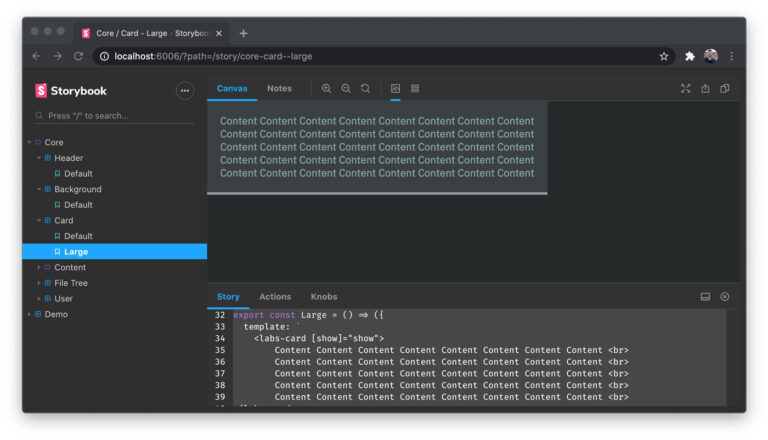
The second story looks similar to the first, but it contains more content to visualize and test the card component with large contents.
					// from card.component.ts
export const Large = () => ({
  template: `
    <labs-card [show]="show">
        Content Content Content Content Content Content Content Content <br>
        Content Content Content Content Content Content Content Content <br>
        Content Content Content Content Content Content Content Content <br>
        Content Content Content Content Content Content Content Content <br>
        Content Content Content Content Content Content Content Content <br>
</labs-card>
  `,
  props: {
    show: boolean('show', true),
  },
});
The card component with large contents looks like this:
The second story
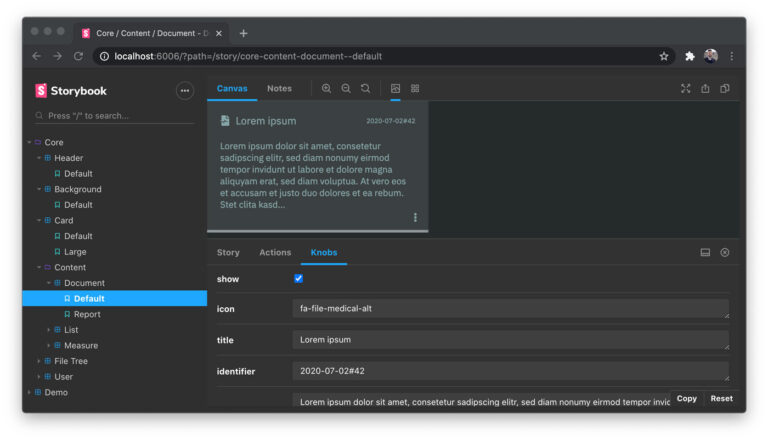
In the following step, I want to create a card component with document content.
					// from document-content.component.stories.ts
export const Default = () => ({
  template: `
    <labs-card [show]="show">
        <labs-document-content [icon]="icon" [identifier]="identifier" [preview]="preview" [title]="title"></labs-document-content>
    </labs-card>
  `,
  props: {
    show: boolean('show', true),
    icon: text('icon', 'fa-file-medical-alt'),
    title: text('title', 'Lorem ipsum'),
    identifier: text('identifier', '2020-07-02#42'),
    preview: text('preview', 'Lorem ipsum dolor sit amet, co [...] a rebum. Stet clita kasd…'),
  },
});
The dashboard story
After developing small components like cards, we could create a complex layout component to render components as a list or grid. The dashboard component should do this job. The dashboard should be accessible via the corresponding route. For this case, I used the root component with router configuration in my story. The root components contain the app header, animated background, as well as the logo.
					// from root.component.stories.ts
import {RootComponent} from './root.component';
import {withKnobs} from '@storybook/addon-knobs';
import {moduleMetadata} from '@storybook/angular';
import {MatRippleModule} from '@angular/material/core';
import {MatProgressSpinnerModule} from '@angular/material/progress-spinner';
import {MeasureContentComponent} from '../measure-content/measure-content.component';
import {AppHeaderComponent} from '../app-header/app-header.component';
import {BackgroundComponent} from '../background/background.component';
import {UserComponent} from '../user/user.component';
import {MatButtonModule} from '@angular/material/button';
import {CardComponent} from '../card/card.component';
import {BrowserAnimationsModule} from '@angular/platform-browser/animations';
import {DocumentContentComponent} from '../document-content/document-content.component';
import {FormsModule} from '@angular/forms';
import {MatCheckboxModule} from '@angular/material/checkbox';
import {ListContentComponent} from '../list-content/list-content.component';
import {FileTreeComponent} from '../file-tree/file-tree.component';
import {RouterModule} from '@angular/router';
import {DashboardComponent} from '../dashboard/dashboard.component';
import {APP_BASE_HREF} from '@angular/common';
import {DetailsComponent} from '../details/details.component';
import {TaskService} from '../../services/task.service';
import {of} from 'rxjs';

const tasks = [
  {title: 'Lorem ipsum dolor sit amet, consectetur adipiscing elit', checked: true},
  {title: 'Lorem ipsum dolor sit amet, consectetur adipiscing elit'},
  {title: 'Lorem ipsum dolor sit amet, consectetur adipiscing elit'},
  {title: 'Lorem ipsum dolor sit amet, consectetur adipiscing elit'},
  {title: 'Lorem ipsum dolor sit amet, consectetur adipiscing elit'},
  {title: 'Lorem ipsum dolor sit amet, consectetur adipiscing elit'},
  {title: 'Lorem ipsum dolor sit amet, consectetur adipiscing elit'},
  {title: 'Lorem ipsum dolor sit amet, consectetur adipiscing elit'},
  {title: 'Lorem ipsum dolor sit amet, consectetur adipiscing elit'},
];

export default {
  title: 'Demo',
  decorators: [
    withKnobs,
    moduleMetadata({
      declarations: [
        DocumentContentComponent,
        BackgroundComponent,
        AppHeaderComponent,
        MeasureContentComponent,
        UserComponent,
        CardComponent,
        ListContentComponent,
        FileTreeComponent,
        DashboardComponent,
        DetailsComponent,
      ],
      imports: [
        MatRippleModule,
        MatProgressSpinnerModule,
        MatButtonModule,
        FormsModule,
        BrowserAnimationsModule,
        MatCheckboxModule,
        RouterModule.forRoot([
          {path: '', redirectTo: '/dashboard', pathMatch: 'full'},
          {
            path: 'dashboard', component: DashboardComponent, children: [
              {path: ':id', component: DetailsComponent},
            ],
          },
        ], {useHash: true}),
      ],
      providers: [
        {provide: APP_BASE_HREF, useValue: '/'},
        // mock tasks service
        {
          provide: TaskService, useValue: {
            getAllTasks: () => of(tasks),
          },
        },
      ],
    }),
  ],
};

export const Default = () => ({
  component: RootComponent,
});
Final touches: Creating the resulting Angular app
To get the Angular app ready, we should implement all mocked services and add authentication if required. The last configuration step is to import all required modules and declare all components, pipes, and so on in the app module. This step is easy because you could use the same module metadata like in the root.component.stories.ts, but without the mocked providers.
This command compiles the Angular app with production configuration to the dist folder:
npx ng build --prod
Summary
This article hopefully provided you with an idea of my approach to design and implement user interfaces with customers in a lightweight requirement-based way. This component-centric way, and using the mentioned tools, makes it possible to quickly build UIs and evaluate ideas. Feel free to contact me if you need assistance in designing and developing your modern web applications.